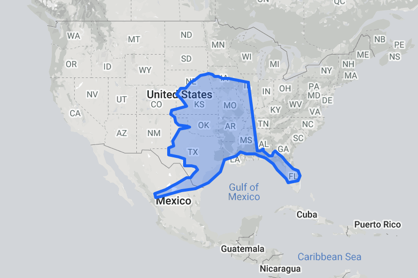
One other effect that the distortion in Mercator Projection maps introduces is that land areas closer to the poles appear, on the map, to be bigger – sometimes much bigger – than similarly-sized land areas closer to the equator. Have you ever looked at Greenland on a ‘normal’ map and wondered at how big it looks? Or Alaska? We all know that Alaska is the biggest State in the Union, but is it really half the size of continental USA? No, it’s not. The image above shows how it compares when the distortion is removed and it’s placed alongside the other 48 continental States. Yes, it’s still big but not as big as it appeared.
There’s a website (as there always is) that allows you to select individual countries and then moving them around the map. Great fun, but also instructive. Here’s the link: https://www.thetruesize.com. Start by clicking on ‘Clear the Map’ – that will deselect the countries selected by default when you first access the map – then type the name of the country you want in the box – that will highlight that country. You can then select the country and drag it around the map, resize the map, etc.
The images below show some other interesting comparisons: India placed over Europe – when seen at the same scale as Europe it stretches from northern Norway to the toe of Italy, and from London to east of Moscow; the UK on top of Australia – actually, on top of less than half of just one State; and especially for my sister, Turkey (she lives there) lying on top of Europe, with London and Istanbul just about contiguous.
-
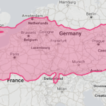
- Turkey over Europe
-
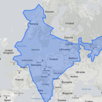
- India over Europe
-
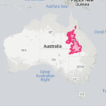
- UK over Australia